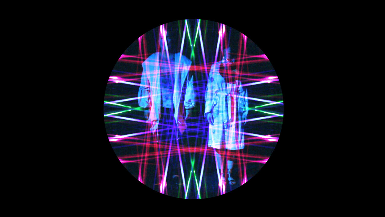
Beginning as a logo refresh, this service needed a brand that felt more contemporary and relevant to its audience. A simple logotype evolved into creating an overlapping “A” motif that plays with dimension in the brand story. The motif is modular and connects surfaces and spatial relations. This flexible identity lends itself well to the diversity of projects produced by the company.

